skip to main |
skip to sidebar
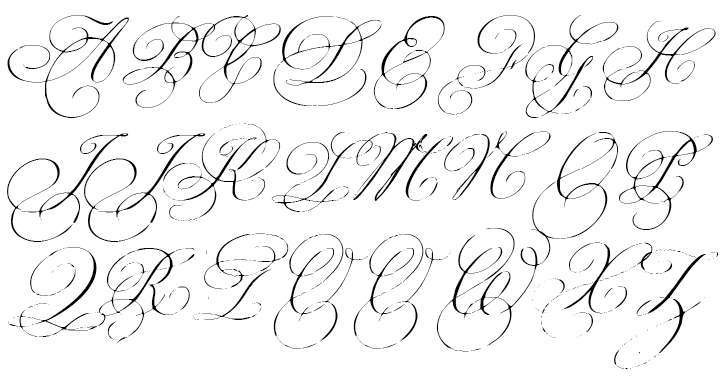
Early in the planning process, I put a lot of thought into how one might plan a day that was cost-effective and cohesive. We are fortunate to have a very nice budget, but its not going to be a platinum wedding, so we wanted to make sure every dollar counts! One of the first things I thought about was how to repeat themes and colors and ideas. And of course, one of the easiest ways to do this- though subtle- is through use of the same fonts throughout stationary and accessories. Looking at fonts is downright captivating, with so many options out there (and by the way, if you are looking for good free fonts, check out www.dafont.com)! After looking at various invitations and deciding on ours, the rest was a piece of cake. Our wedding will, with only one tiny exception, incorporate two fonts: Bickham (with the Swash caps) and Copperplate Gothic Light. One is swirly and decadent, the other is simple and a bit historical. They look good paired together or standing alone, and one or the other always seems to work, no matter what project I'm working on.

Once I had decided on fonts, I decided to purchase an embosser incorporating the latter, and let me just say that someone should hide it from me because I've started embossing everything in sight! Yep, these little stamps will be showing up on programs, favors, OOT bags and probably even thank-you notes. I got ours from Wilshire Graphic Press, and I felt they were extremely easy to work with- they sent proofs right away, and I've been able to repurpose that image for a few other projects! They even told me that the original hand-held embosser I had chosen wouldn't leave a good imprint with my stamp, and suggested a better substitute at the same price, thereby saving me hours of hand-cramping madness. Is there a special little wedding detail captivating you?


nu=323+%29%3B39%29782%29WSNRCG%3D32966535+8339nu0mrj.jpg)


No comments:
Post a Comment